May 7, 2020
NIGHT MODE
DAY MODE
Using the true strokes-gained metric in amateur golf
- An intuitive explanation and a comparision to the WAGR system
We recently expanded our database of round scores to include a
comprehensive set of amateur events dating back to the fall of 2009.
This includes any event that is eligible for points in the World Amateur
Golf Rankings (WAGR), as well as the vast majority of college
events played in the United
States (most of which are also included in the WAGR). By linking the golfers
in the amateur data to our existing data for the professional tours, we are able
to estimate a single strokes-gained measure that can be directly compared
across any tournament and tour. That is, a value of +2 for this measure
for a round played in the Canadian Men's Amateur and a value of +2 for a round
played in the U.S. Open will indicate performances of equal quality. Pretty cool;
but why should you believe our numbers? The purpose of this blog is to provide
some transparent arguments for the validity and usefulness of this adjusted,
or "true", strokes-gained measure.
We'll tackle validity first. The motivating idea behind converting raw scores to adjusted scores is that we only want to compare golfers who played at the same course on the same day, in order to control for the large differences in course difficulty that exist across the many global tours and tournaments. However, the obvious issue is that most golfers never compete directly against each other. To compare scores shot in different tournaments, we make use of the fact that there is overlap in the set of golfers that compete in different tournaments. For example, if Matthew Wolff beats Justin Suh by 2 strokes per round at the NCAA Championship, and then Rory McIlroy beats Matthew Wolff by 2 strokes per round at a PGA Tour event a few weeks later, we could (maybe?) conclude that McIlroy is 4 strokes per round better than Suh, despite the fact that they never played against each other! Of course, this seems like a bad idea because we know that golfers have "good" and "bad" days; if Wolff had a good day when he played against Suh, and a bad day when he played against McIlroy, this would lead us to overestimate how much better McIlroy is than Suh. This problem is mitigated if we have not just one golfer connecting McIlroy to Suh but many: some golfers will have bad days and some will have good days, but on average it should even out. The basic logic described here allows us to fairly compare scores shot in major championships to those shot in tournaments as obscure as the Slovenian National Junior Championship. All that is required is that these tournaments can be "connected" in some way; that is, a player in the Slovenian Championship needs to be able to say, "I played against a golfer who played against a golfer... who played against a golfer in a major championship". The fewer connections a tournament has to the rest of the golfing world, the less certain we can be about the quality of the performances from that tournament; in the extreme case of having no connections, we can say nothing about how those performances compare to other tournaments. Therefore, to be included in our database, all tournaments must be connected in this sense. Luckily, competitive golf, like the real world, is a lot more connected than you might think.
Let's next look at some simple data summaries to provide some reassuring evidence that the true strokes-gained metric is accomplishing what we want it to. This first table compares a golfer's performance in Korn Ferry Tour events in 2019 to their performance in PGA Tour events in 2019. We show 10 golfers who played a reasonable number of rounds on both tours last year:
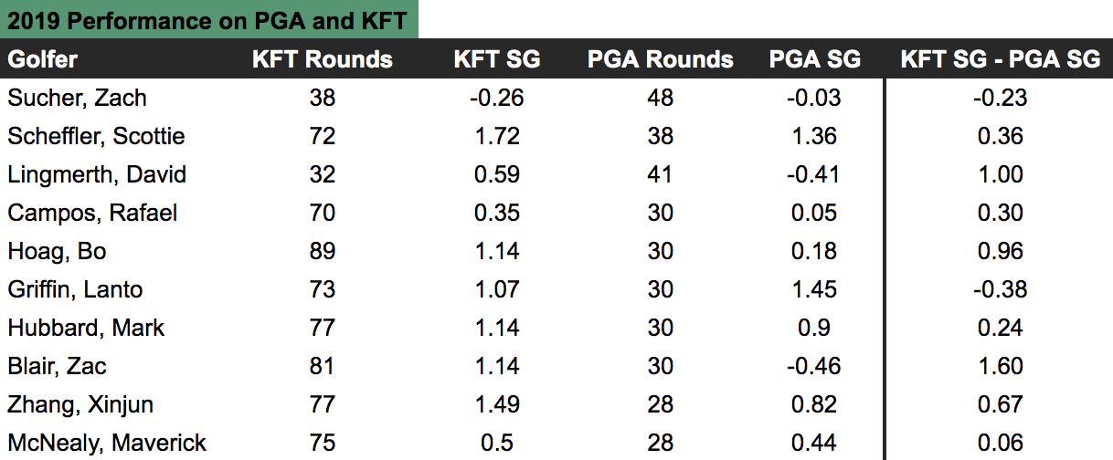
 The far right column is the one of interest: this tells us how many more strokes
per round each golfer gained against KFT fields than they did against PGA Tour fields. A positive
value indicates that they beat KFT fields by more on average; a negative value
indicates the opposite. Why would the same golfer beat KFT fields by more than
PGA Tour fields? Presumably, it's because the average player on the latter tour is
better than the average player on the former. The fact that there are large differences between golfers in
their relative performance on the two tours simply reflects the fact that golf
performance is random; some golfers may happen to play really well
in the PGA Tour events they enter (e.g. Lanto Griffin).
The next table shows the overall numbers from this exercise
for 2019 for 3 different tours:
The far right column is the one of interest: this tells us how many more strokes
per round each golfer gained against KFT fields than they did against PGA Tour fields. A positive
value indicates that they beat KFT fields by more on average; a negative value
indicates the opposite. Why would the same golfer beat KFT fields by more than
PGA Tour fields? Presumably, it's because the average player on the latter tour is
better than the average player on the former. The fact that there are large differences between golfers in
their relative performance on the two tours simply reflects the fact that golf
performance is random; some golfers may happen to play really well
in the PGA Tour events they enter (e.g. Lanto Griffin).
The next table shows the overall numbers from this exercise
for 2019 for 3 different tours:
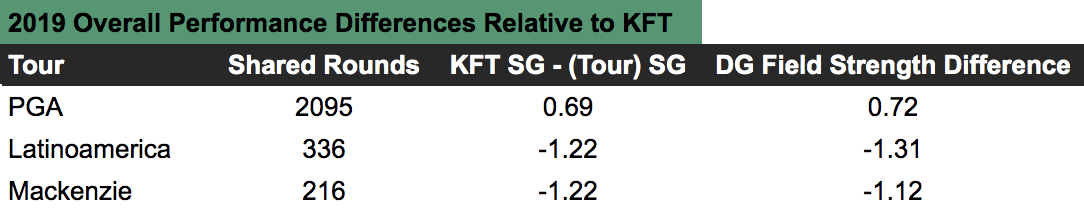
 Looking at the first row, we see that in total there were 2095 "shared" rounds —
defined for each golfer as the minimum of the number of rounds they played on
each tour, e.g. for Sucher in the first table
it would be 38 — and that on average the same golfer gained 0.69 more strokes
per round against KFT fields than they did against PGA Tour fields. The final column is our estimate,
from the true strokes-gained method, of the difference in the average player quality between the
KFT and PGA Tour fields used in this calculation. Ideally we want these last two
columns to be equal — if the average golfer is in fact 0.72 strokes better in these
PGA Tour events, we should see a given set of golfers gaining approximately 0.72 fewer strokes
against those fields, which we do.
Looking at the first row, we see that in total there were 2095 "shared" rounds —
defined for each golfer as the minimum of the number of rounds they played on
each tour, e.g. for Sucher in the first table
it would be 38 — and that on average the same golfer gained 0.69 more strokes
per round against KFT fields than they did against PGA Tour fields. The final column is our estimate,
from the true strokes-gained method, of the difference in the average player quality between the
KFT and PGA Tour fields used in this calculation. Ideally we want these last two
columns to be equal — if the average golfer is in fact 0.72 strokes better in these
PGA Tour events, we should see a given set of golfers gaining approximately 0.72 fewer strokes
against those fields, which we do.
The next two tables repeat the exercise using golfers who played in amateur events in 2019.
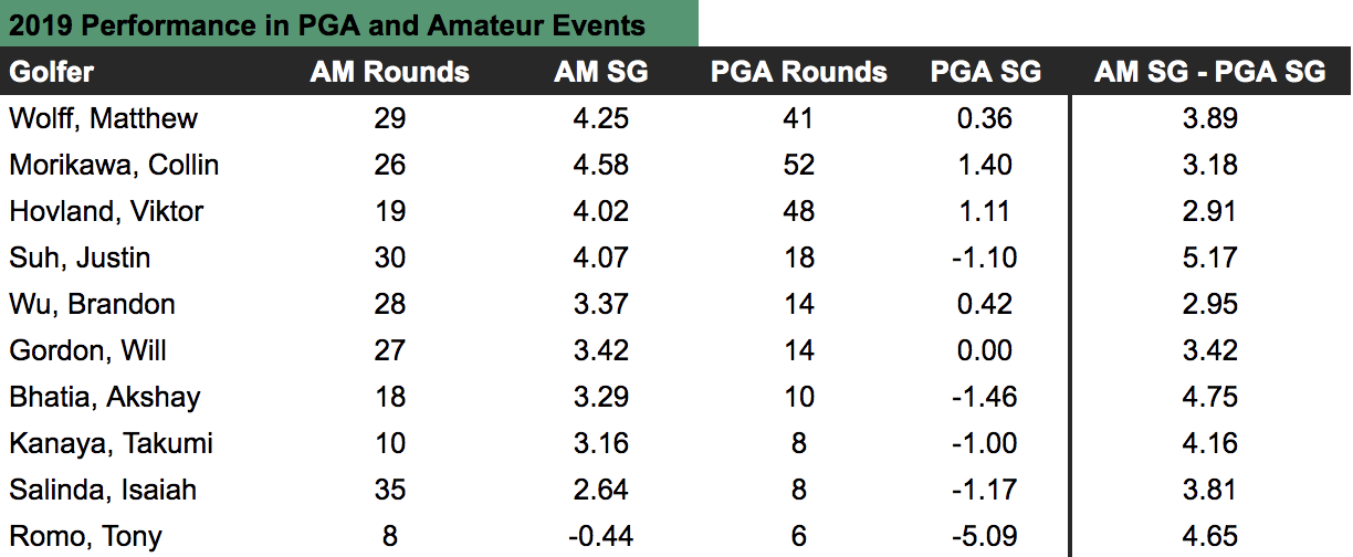
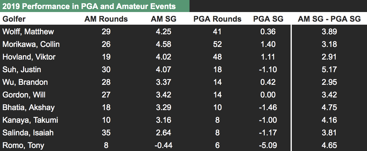

 In this second set of tables, we see that
when amateurs play in PGA Tour events the difference between their
strokes-gained over fields on the PGA Tour and their strokes-gained over amateur fields
is on average equal to 3.7. From this we should infer that the average
golfer in these PGA Tour events is 3.7 strokes better than the average golfer in these
amateur events; almost exactly (3.61) what our true strokes-gained method estimated the difference
to be.
In this second set of tables, we see that
when amateurs play in PGA Tour events the difference between their
strokes-gained over fields on the PGA Tour and their strokes-gained over amateur fields
is on average equal to 3.7. From this we should infer that the average
golfer in these PGA Tour events is 3.7 strokes better than the average golfer in these
amateur events; almost exactly (3.61) what our true strokes-gained method estimated the difference
to be.
Adjusted or "true" strokes-gained is equal to a golfer’s strokes-gained over the field plus how many strokes better (or worse) that field is than some benchmark. Because it is trivial to calculate strokes-gained over the field, it should be clear that the validity of true strokes-gained hinges on properly estimating field strengths. In the exercise above we showed that our estimates of average player quality for different tours closely match the estimates you would obtain by simply comparing the performance of a set of golfers against one tour to the performance of that same set of golfers against another tour. This provides an intuitive way to understand differences in field strength across tours rather than having to simply place blind trust in our model being correct.
What is this benchmark I mentioned above? Strokes-gained is a relative measure, meaning that it is only useful insofar as we have something to compare it to. Just as it’s not very useful to tell me the raw score of a golfer (e.g. 66) without providing the field’s average score that day, it’s also not useful to tell me that a golfer gained 4 strokes without telling me who they "gained strokes over". We typically set the benchmark to be the average field on the PGA Tour in a given season. Therefore, if, in the year 2019, a golfer has an adjusted strokes-gained of +2 in a given round, this means that their performance was estimated to be two strokes better than what the average PGA Tour field in 2019 would be expected to shoot on that course. An adjusted strokes-gained of +2 could be achieved by beating a field that is on average 1 shot better than the average PGA Tour field (e.g. the TOUR Championship) by 1 stroke, or by beating a field that is on average 1 stroke worse than the average PGA Tour field (e.g. a typical Korn Ferry Tour event) by 3 strokes.
Hopefully this has helped clarify how the true strokes-gained measure is derived and also why it is valid to directly compare the true strokes-gained numbers of golfers who competed in different tournaments. Next, we are going to show why the true strokes-gained metric is useful.
The World Amateur Golf Rankings are put on by the USGA and R&A with the stated aim of providing a comprehensive and accurate ranking of amateur golfers. We are going to compare our amateur ranking system, which is solely based off the true strokes-gained metric, to the WAGR system. More precisely, our amateur rankings are determined by taking a weighted average of each golfers' historical true strokes-gained, with more recent rounds receiving more weight. For golfers with many rounds played, approximately their most recent 150 rounds contribute to their ranking. The WAGR operates in a similar fashion to the Official World Golf Ranking (OWGR) with rounds from the last 104 weeks contributing to their rankings. The main differences between our rankings and the WAGR is that we only include stroke play rounds while the WAGR includes both stroke and match play, and that the WAGR rewards top finishers disproportionately — as all official rankings systems do, and should — while our rankings only depend on golfers' scores and not their finish position.
The exercise we will do is the following: first, we form our rankings for every week since September 2011 using the same time frame as WAGR; that is, for a given week all events that have been played on or before the most recent Sunday are included in the ranking calculation. (WAGR releases rankings on Wednesday, so events that are played on the Monday and Tuesday of that week only count in the following week's rankings.) Second, we use each of these ranking systems to predict the performance of golfers who are playing in the following week. To be clear, the events we are predicting always occurred after the date on which the rankings were formed.
Our measure of performance is strokes-gained relative-to-the-field — this is what we are trying to predict. An example will help clarify exactly how this prediction exercise works. In the first round of the 2020 Junior Invitational at Sage Valley, which took place on March 12-14, there were 37 golfers that could be matched to both the WAGR and our rankings on March 11, 2020. The field was comprised of 52 golfers, meaning that 15 golfers weren't matched either because they hadn't played a round in the last year (requirement to be in our rankings), or they weren't in the top 1000 of the WAGR. Using these 37 golfers, we subtract the average value of our 3 variables of interest: their round score, their Data Golf (DG) ranking, and their WAGR ranking. Then, we correlate their relative-to-field ranking with their score relative to the field. For example, heading into this tournament Conor Gough was ranked 27th in the WAGR and 279th in the DG rankings; Gough ultimately shot 72 in the first round. The average WAGR ranking of the 36 golfers playing in this first round was 372, and their average DG ranking was 271; their average score that day was 73.3. Therefore, Gough was ranked well above average in this field by WAGR (+345), was ranked slightly below average by DG (-8), and he ended up beating the field by 1.3 strokes (+1.3 strokes-gained). Therefore, in this single instance, the WAGR rankings could be said to have been more predictive of Gough's performance that day.
We do this exercise using every tournament-round in our database where at least 2 golfers can be matched to both the WAGR and our rankings. This results in 306,431 data points to predict. Finally, we run 3 regressions (simply think of a regression as a way of predicting some variable Y with some other variable X): 1) a regression of a golfer's strokes-gained on their DG ranking; 2) a regression of their strokes-gained on their WAGR ranking; and 3) a regression of strokes-gained on both their DG and WAGR rankings. The summary measure we will use from these regressions is the percentage of strokes-gained that can be explained by each ranking system (e.g. if the DG rankings indicate golfer A is ranked higher than golfer B, and golfer A goes on to beat golfer B, we would say the DG rankings "explained" this result to some degree). In statistical parlance this is known as the "R-squared" of a regression.
Finally, let's see some results. When using the previous week's ranking to predict performance in the current week, the WAGR can explain 4.93% of golfers' strokes-gained; the DG rankings can explain 6.67%; and using the rankings together they can explain 6.72%. (The low values for these percentages reflects the fact that golf performance on any given day is mostly not explainable by past performance.) If we perform the same exercise described so far, except using the rankings from 2 weeks ago, or 3 weeks ago, etc, we get the following results:
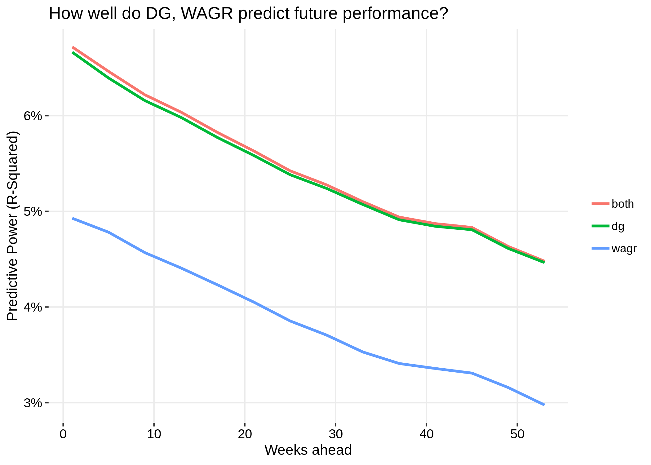
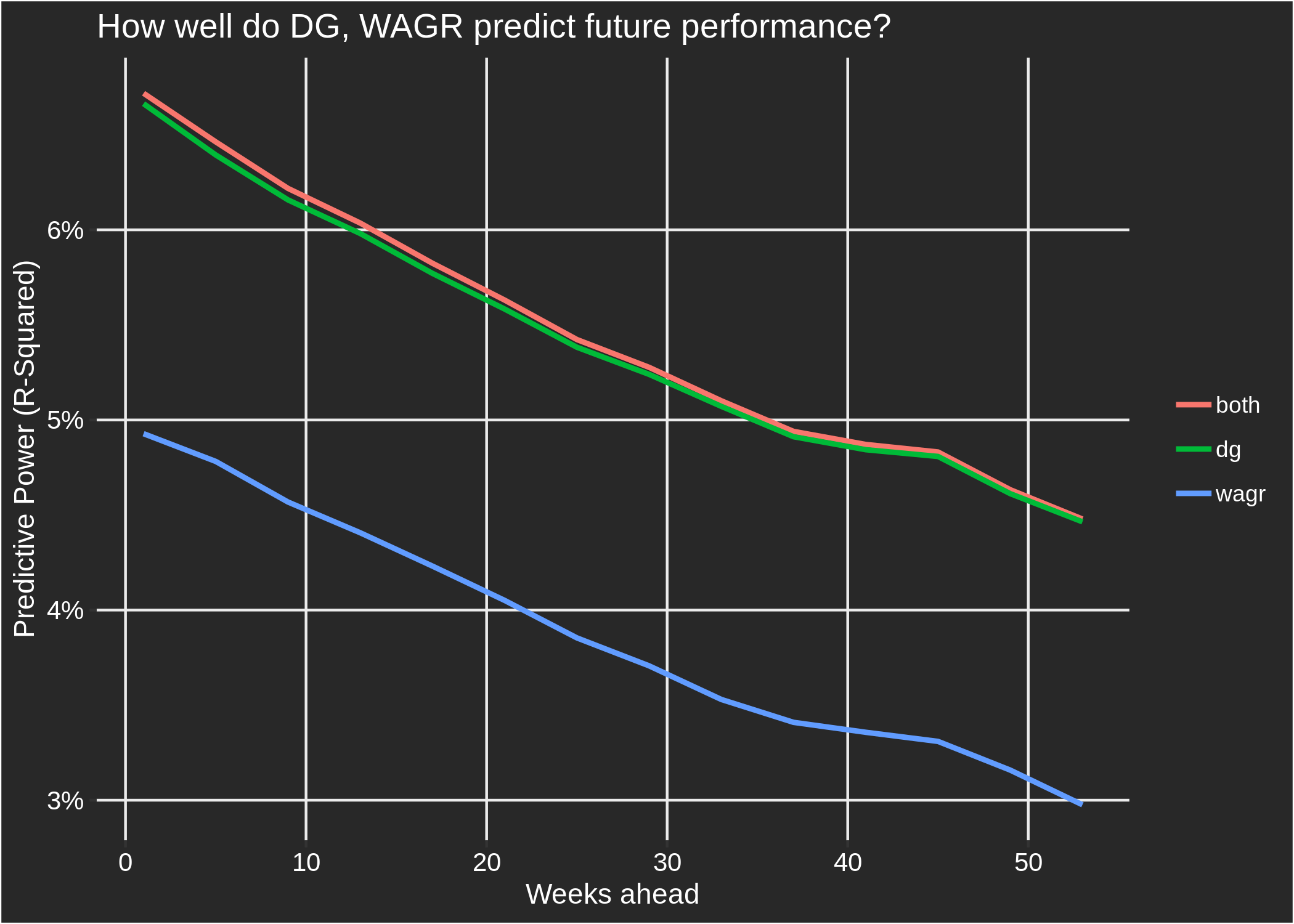 As you would expect, the predictive power for both ranking systems declines as we predict further into the future.
For any time horizon, it can be seen that the DG rankings vastly outperform the WAGR in terms of predicting performance.
The "both" line represents the quality of predictions that can be achieved by leveraging information from both ranking systems; for short-term
predictions, WAGR does add a bit of predictive value to the DG rankings, but for longer-term predictions this help disappears.
The small added benefit of WAGR likely comes from the fact that there is some value in incorporating match play performances into amateur rankings,
and also because there were some events where we could not apply our scoring adjustment method and thus do not contribute to the DG rankings.
The fact that using both DG and WAGR together adds very little value on top of DG alone indicates that if you know
a golfer's DG ranking, additionally knowing their WAGR rank provides only a small amount of new information with regards to the quality
of the golfer.
As you would expect, the predictive power for both ranking systems declines as we predict further into the future.
For any time horizon, it can be seen that the DG rankings vastly outperform the WAGR in terms of predicting performance.
The "both" line represents the quality of predictions that can be achieved by leveraging information from both ranking systems; for short-term
predictions, WAGR does add a bit of predictive value to the DG rankings, but for longer-term predictions this help disappears.
The small added benefit of WAGR likely comes from the fact that there is some value in incorporating match play performances into amateur rankings,
and also because there were some events where we could not apply our scoring adjustment method and thus do not contribute to the DG rankings.
The fact that using both DG and WAGR together adds very little value on top of DG alone indicates that if you know
a golfer's DG ranking, additionally knowing their WAGR rank provides only a small amount of new information with regards to the quality
of the golfer.
These results should not be surprising; we constructed our rankings to predict performance as well as possible. Conversely, the WAGR also has to consider notions of fairness and deservedness: if, in the U.S. Amateur, a golfer plays a mediocre first two rounds but qualifies for the match play portion and ultimately wins the tournament, they will receive a huge boost to their WAGR position. However, their standing in our rankings may hardly rise, or may even decline depending on their previous skill level, because we only take into account the stroke play portion of the U.S. Amateur. Even though match play rounds have little predictive power (not zero; but not a lot) for a golfer's future performance, it is still likely the case that a ranking system should reward top performances in match play events. More generally, the WAGR rewards wins and top finishes disproportionately — the difference in WAGR points between finishing 1st and 2nd is larger than the difference between 10th and 11th. Again, this is not ideal for maximizing the predictive power of your rankings, but in our opinion it is how an official ranking system should function. All of this is just to say that the main reason the DG rankings outperform the WAGR in predicting future performance is that our rankings were constructed with that as the sole objective, while the WAGR has other factors to consider. Finally, for inquiring minds, the correlation between the DG and WAGR rankings is equal to 0.76 — meaning that, for the most part, the two ranking systems do generally agree.
To conclude, let's look at one dimension of the WAGR where an undesirable bias could exist: that tournaments played in specific geographic regions of the world recieve too many points on average. This is a logical dimension to look at because there is less overlap between the set of golfers competing at tournaments in distinct parts of the globe, making it more difficult for the WAGR point allocation to accurately reflect field strength differences. Unfortunately, we don't actually have exact data on where tournaments were played, but as a proxy for that we use a golfers' nationality; below we plot golfers' WAGR rank against their DG rank for a few different nationalities:
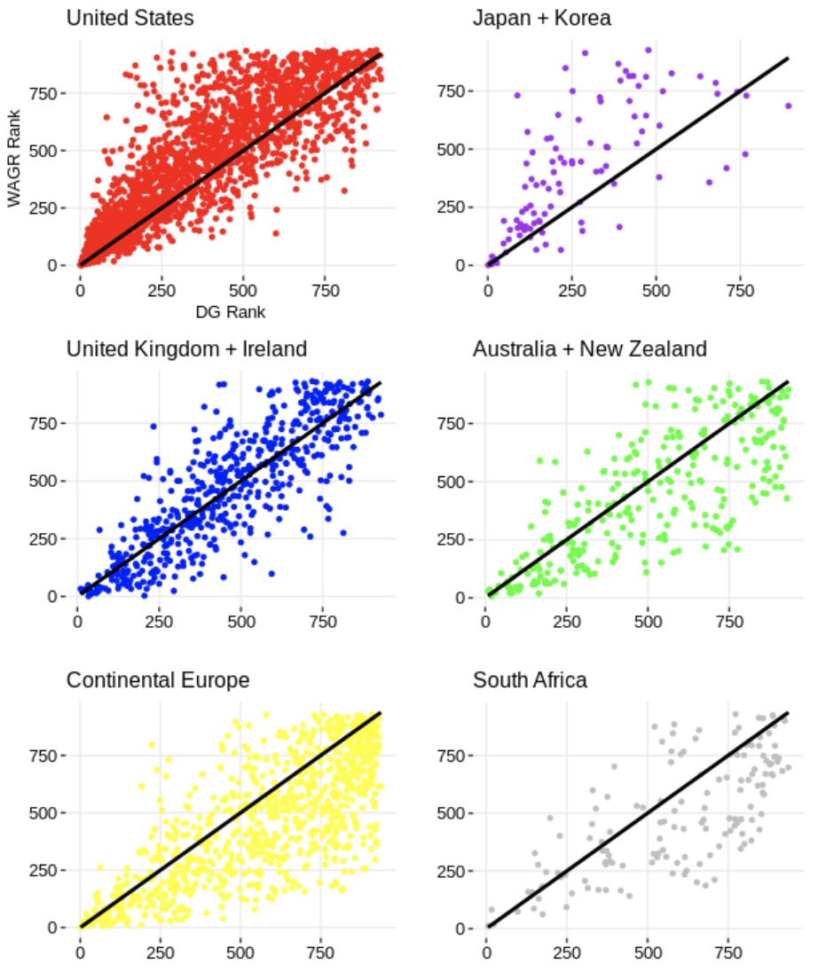
 These plots use end-of-year WAGR and DG rankings for the years 2011, 2013, 2015, 2017, and 2019. (Even years
are excluded so we don't double count, as the WAGR operates on a 2-year cycle). Each data point represents a golfer
in one of those years. The plots with a majority of data points above the 45 degree line (i.e. DG = WAGR) indicate that
golfers from that country are, on average, ranked worse in the WAGR than the DG rankings; plots with a greater number of points
below the 45 degree line indicate the opposite — that the WAGR ranks them more favourably than our rankings.
The United States, Japan, and Korea all fall into the former category, while Continental Europe, Australia, New Zealand, and
South Africa fall into the latter. Golfers from the UK and Ireland are ranked similarly on average by the two ranking systems.
Given that golfers don't just compete in their home countries — the most obvious example of this
being the US college golf scene — our guess is that these plots underestimate the bias present in the tournaments that actually
take place in the listed countries. That is, even though most European amateurs play some of their events in the United States, the fact
that they play a higher-than-typical fraction in Europe is enough to introduce the bias we see in their plot. Our finding that
golfers from Japan and Korea are treated unfavourably by WAGR is surprising, as we
have found the opposite to be true
in the Official World Golf Rankings. The finding that players in the United States are ranked worse in the WAGR
than in our rankings is similar to what we have found when analyzing the OWGR, and also with
work
that Mark Broadie has done regarding bias in the OWGR.
These plots use end-of-year WAGR and DG rankings for the years 2011, 2013, 2015, 2017, and 2019. (Even years
are excluded so we don't double count, as the WAGR operates on a 2-year cycle). Each data point represents a golfer
in one of those years. The plots with a majority of data points above the 45 degree line (i.e. DG = WAGR) indicate that
golfers from that country are, on average, ranked worse in the WAGR than the DG rankings; plots with a greater number of points
below the 45 degree line indicate the opposite — that the WAGR ranks them more favourably than our rankings.
The United States, Japan, and Korea all fall into the former category, while Continental Europe, Australia, New Zealand, and
South Africa fall into the latter. Golfers from the UK and Ireland are ranked similarly on average by the two ranking systems.
Given that golfers don't just compete in their home countries — the most obvious example of this
being the US college golf scene — our guess is that these plots underestimate the bias present in the tournaments that actually
take place in the listed countries. That is, even though most European amateurs play some of their events in the United States, the fact
that they play a higher-than-typical fraction in Europe is enough to introduce the bias we see in their plot. Our finding that
golfers from Japan and Korea are treated unfavourably by WAGR is surprising, as we
have found the opposite to be true
in the Official World Golf Rankings. The finding that players in the United States are ranked worse in the WAGR
than in our rankings is similar to what we have found when analyzing the OWGR, and also with
work
that Mark Broadie has done regarding bias in the OWGR.
There are many other dimensions that could be explored to better understand any inconsistencies and biases in the WAGR system. With our strokes-gained model, it is possible to drill down to the event level and examine whether too many or too few points are being allocated to a given event. The basic idea is that we are able to estimate the expected WAGR points for a golfer of a given skill level — e.g. the average NCAA D1 golfer — at each event; the higher the expected number of WAGR points for this golfer, the more favourable is the WAGR point allocation at that event. That will have to be explored another day, however, as I am tired and this blog is already too long.
We'll tackle validity first. The motivating idea behind converting raw scores to adjusted scores is that we only want to compare golfers who played at the same course on the same day, in order to control for the large differences in course difficulty that exist across the many global tours and tournaments. However, the obvious issue is that most golfers never compete directly against each other. To compare scores shot in different tournaments, we make use of the fact that there is overlap in the set of golfers that compete in different tournaments. For example, if Matthew Wolff beats Justin Suh by 2 strokes per round at the NCAA Championship, and then Rory McIlroy beats Matthew Wolff by 2 strokes per round at a PGA Tour event a few weeks later, we could (maybe?) conclude that McIlroy is 4 strokes per round better than Suh, despite the fact that they never played against each other! Of course, this seems like a bad idea because we know that golfers have "good" and "bad" days; if Wolff had a good day when he played against Suh, and a bad day when he played against McIlroy, this would lead us to overestimate how much better McIlroy is than Suh. This problem is mitigated if we have not just one golfer connecting McIlroy to Suh but many: some golfers will have bad days and some will have good days, but on average it should even out. The basic logic described here allows us to fairly compare scores shot in major championships to those shot in tournaments as obscure as the Slovenian National Junior Championship. All that is required is that these tournaments can be "connected" in some way; that is, a player in the Slovenian Championship needs to be able to say, "I played against a golfer who played against a golfer... who played against a golfer in a major championship". The fewer connections a tournament has to the rest of the golfing world, the less certain we can be about the quality of the performances from that tournament; in the extreme case of having no connections, we can say nothing about how those performances compare to other tournaments. Therefore, to be included in our database, all tournaments must be connected in this sense. Luckily, competitive golf, like the real world, is a lot more connected than you might think.
Let's next look at some simple data summaries to provide some reassuring evidence that the true strokes-gained metric is accomplishing what we want it to. This first table compares a golfer's performance in Korn Ferry Tour events in 2019 to their performance in PGA Tour events in 2019. We show 10 golfers who played a reasonable number of rounds on both tours last year:
The next two tables repeat the exercise using golfers who played in amateur events in 2019.
Adjusted or "true" strokes-gained is equal to a golfer’s strokes-gained over the field plus how many strokes better (or worse) that field is than some benchmark. Because it is trivial to calculate strokes-gained over the field, it should be clear that the validity of true strokes-gained hinges on properly estimating field strengths. In the exercise above we showed that our estimates of average player quality for different tours closely match the estimates you would obtain by simply comparing the performance of a set of golfers against one tour to the performance of that same set of golfers against another tour. This provides an intuitive way to understand differences in field strength across tours rather than having to simply place blind trust in our model being correct.
What is this benchmark I mentioned above? Strokes-gained is a relative measure, meaning that it is only useful insofar as we have something to compare it to. Just as it’s not very useful to tell me the raw score of a golfer (e.g. 66) without providing the field’s average score that day, it’s also not useful to tell me that a golfer gained 4 strokes without telling me who they "gained strokes over". We typically set the benchmark to be the average field on the PGA Tour in a given season. Therefore, if, in the year 2019, a golfer has an adjusted strokes-gained of +2 in a given round, this means that their performance was estimated to be two strokes better than what the average PGA Tour field in 2019 would be expected to shoot on that course. An adjusted strokes-gained of +2 could be achieved by beating a field that is on average 1 shot better than the average PGA Tour field (e.g. the TOUR Championship) by 1 stroke, or by beating a field that is on average 1 stroke worse than the average PGA Tour field (e.g. a typical Korn Ferry Tour event) by 3 strokes.
Hopefully this has helped clarify how the true strokes-gained measure is derived and also why it is valid to directly compare the true strokes-gained numbers of golfers who competed in different tournaments. Next, we are going to show why the true strokes-gained metric is useful.
The World Amateur Golf Rankings are put on by the USGA and R&A with the stated aim of providing a comprehensive and accurate ranking of amateur golfers. We are going to compare our amateur ranking system, which is solely based off the true strokes-gained metric, to the WAGR system. More precisely, our amateur rankings are determined by taking a weighted average of each golfers' historical true strokes-gained, with more recent rounds receiving more weight. For golfers with many rounds played, approximately their most recent 150 rounds contribute to their ranking. The WAGR operates in a similar fashion to the Official World Golf Ranking (OWGR) with rounds from the last 104 weeks contributing to their rankings. The main differences between our rankings and the WAGR is that we only include stroke play rounds while the WAGR includes both stroke and match play, and that the WAGR rewards top finishers disproportionately — as all official rankings systems do, and should — while our rankings only depend on golfers' scores and not their finish position.
The exercise we will do is the following: first, we form our rankings for every week since September 2011 using the same time frame as WAGR; that is, for a given week all events that have been played on or before the most recent Sunday are included in the ranking calculation. (WAGR releases rankings on Wednesday, so events that are played on the Monday and Tuesday of that week only count in the following week's rankings.) Second, we use each of these ranking systems to predict the performance of golfers who are playing in the following week. To be clear, the events we are predicting always occurred after the date on which the rankings were formed.
Our measure of performance is strokes-gained relative-to-the-field — this is what we are trying to predict. An example will help clarify exactly how this prediction exercise works. In the first round of the 2020 Junior Invitational at Sage Valley, which took place on March 12-14, there were 37 golfers that could be matched to both the WAGR and our rankings on March 11, 2020. The field was comprised of 52 golfers, meaning that 15 golfers weren't matched either because they hadn't played a round in the last year (requirement to be in our rankings), or they weren't in the top 1000 of the WAGR. Using these 37 golfers, we subtract the average value of our 3 variables of interest: their round score, their Data Golf (DG) ranking, and their WAGR ranking. Then, we correlate their relative-to-field ranking with their score relative to the field. For example, heading into this tournament Conor Gough was ranked 27th in the WAGR and 279th in the DG rankings; Gough ultimately shot 72 in the first round. The average WAGR ranking of the 36 golfers playing in this first round was 372, and their average DG ranking was 271; their average score that day was 73.3. Therefore, Gough was ranked well above average in this field by WAGR (+345), was ranked slightly below average by DG (-8), and he ended up beating the field by 1.3 strokes (+1.3 strokes-gained). Therefore, in this single instance, the WAGR rankings could be said to have been more predictive of Gough's performance that day.
We do this exercise using every tournament-round in our database where at least 2 golfers can be matched to both the WAGR and our rankings. This results in 306,431 data points to predict. Finally, we run 3 regressions (simply think of a regression as a way of predicting some variable Y with some other variable X): 1) a regression of a golfer's strokes-gained on their DG ranking; 2) a regression of their strokes-gained on their WAGR ranking; and 3) a regression of strokes-gained on both their DG and WAGR rankings. The summary measure we will use from these regressions is the percentage of strokes-gained that can be explained by each ranking system (e.g. if the DG rankings indicate golfer A is ranked higher than golfer B, and golfer A goes on to beat golfer B, we would say the DG rankings "explained" this result to some degree). In statistical parlance this is known as the "R-squared" of a regression.
Finally, let's see some results. When using the previous week's ranking to predict performance in the current week, the WAGR can explain 4.93% of golfers' strokes-gained; the DG rankings can explain 6.67%; and using the rankings together they can explain 6.72%. (The low values for these percentages reflects the fact that golf performance on any given day is mostly not explainable by past performance.) If we perform the same exercise described so far, except using the rankings from 2 weeks ago, or 3 weeks ago, etc, we get the following results:
These results should not be surprising; we constructed our rankings to predict performance as well as possible. Conversely, the WAGR also has to consider notions of fairness and deservedness: if, in the U.S. Amateur, a golfer plays a mediocre first two rounds but qualifies for the match play portion and ultimately wins the tournament, they will receive a huge boost to their WAGR position. However, their standing in our rankings may hardly rise, or may even decline depending on their previous skill level, because we only take into account the stroke play portion of the U.S. Amateur. Even though match play rounds have little predictive power (not zero; but not a lot) for a golfer's future performance, it is still likely the case that a ranking system should reward top performances in match play events. More generally, the WAGR rewards wins and top finishes disproportionately — the difference in WAGR points between finishing 1st and 2nd is larger than the difference between 10th and 11th. Again, this is not ideal for maximizing the predictive power of your rankings, but in our opinion it is how an official ranking system should function. All of this is just to say that the main reason the DG rankings outperform the WAGR in predicting future performance is that our rankings were constructed with that as the sole objective, while the WAGR has other factors to consider. Finally, for inquiring minds, the correlation between the DG and WAGR rankings is equal to 0.76 — meaning that, for the most part, the two ranking systems do generally agree.
To conclude, let's look at one dimension of the WAGR where an undesirable bias could exist: that tournaments played in specific geographic regions of the world recieve too many points on average. This is a logical dimension to look at because there is less overlap between the set of golfers competing at tournaments in distinct parts of the globe, making it more difficult for the WAGR point allocation to accurately reflect field strength differences. Unfortunately, we don't actually have exact data on where tournaments were played, but as a proxy for that we use a golfers' nationality; below we plot golfers' WAGR rank against their DG rank for a few different nationalities:
There are many other dimensions that could be explored to better understand any inconsistencies and biases in the WAGR system. With our strokes-gained model, it is possible to drill down to the event level and examine whether too many or too few points are being allocated to a given event. The basic idea is that we are able to estimate the expected WAGR points for a golfer of a given skill level — e.g. the average NCAA D1 golfer — at each event; the higher the expected number of WAGR points for this golfer, the more favourable is the WAGR point allocation at that event. That will have to be explored another day, however, as I am tired and this blog is already too long.